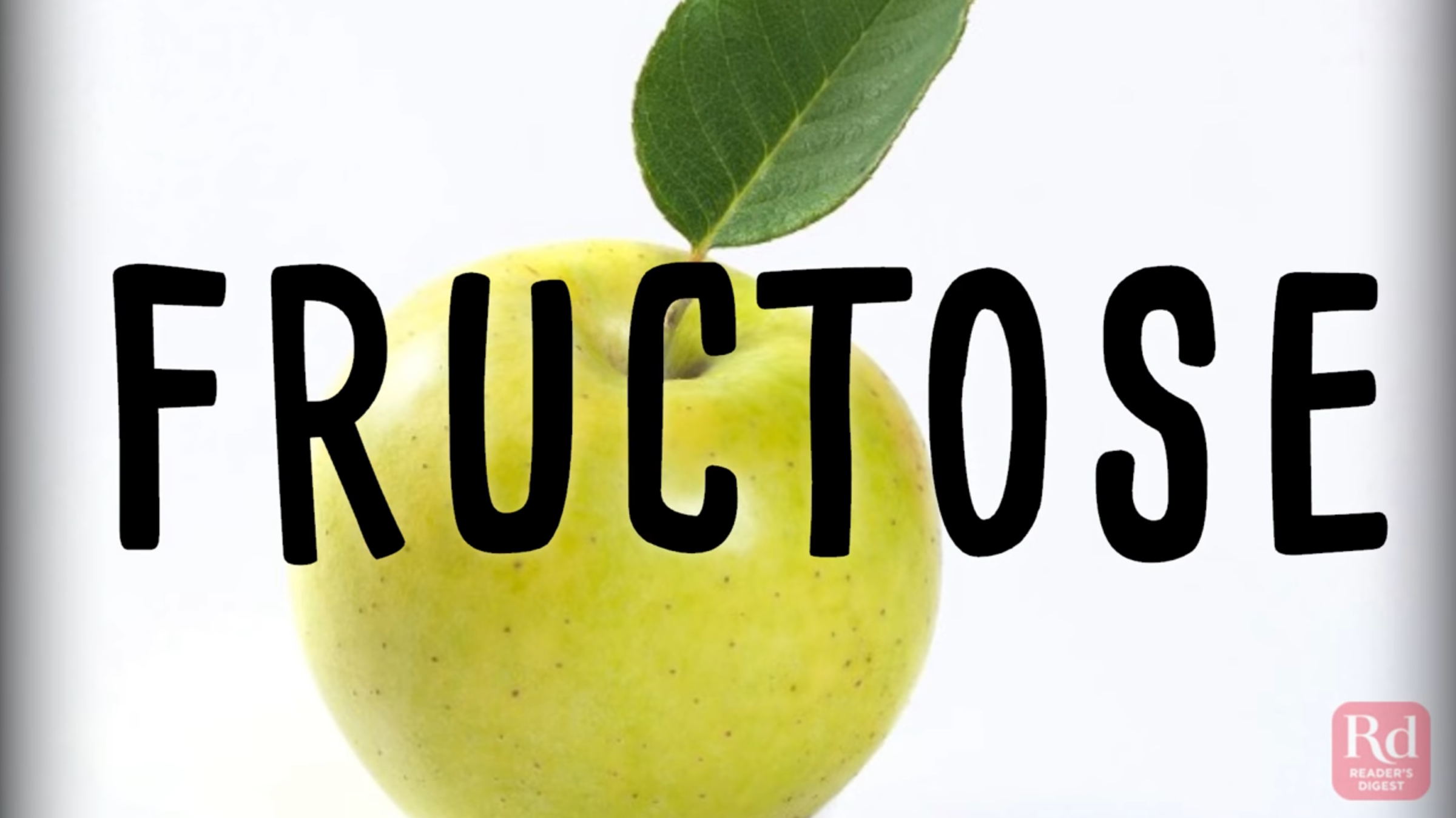
The long-running, general-interest magazine Reader’s Digest is leaning into video creation and the results are already impressive. We’re thrilled they chose Wochit for their creation and production needs. Reader’s Digest’s creative team is regularly pushing out expert videos on their YouTube channel covering a wide range of topics.
Check out this piece on the worst foods for your tummy:
Wow, what a good looking video!
The creators have pulled together gorgeous assets here, both still and motion, that really compliment each other. The rich colors nearly pop out of the frame and the steady stream of new imagery keeps the eye engaged.
The text-overlay adds another layer of great design. The font choice is unique and has a casual “in the kitchen” feel. It’s easy to read, memorable, and gives the piece additional character.
The creators are sure to never put too much text on-screen at once so as to not overwhelm viewers. And they use different sizing and bold effects to make key phrases pop out to viewers.
This piece is kept short, clocking in at exactly one-minute. Patience is in short supply online, and this is in the ideal territory for folks to watch all the way to the end. The horizontal format is still what’s expected on YouTube, and it functions well on any other network where the video might be shared.
This video also sets up and delivers on clear expectations. Viewers like to know what they’re getting into, it makes it likelier they will commit to watching a piece. And consistently delivering on their expectations is a big step in creating trust and loyalty with a publisher.
Reader’s Digest is regularly pushing out striking videos like this one. Each full of character and focused on single issues for their audience. We’re eager to see more!

