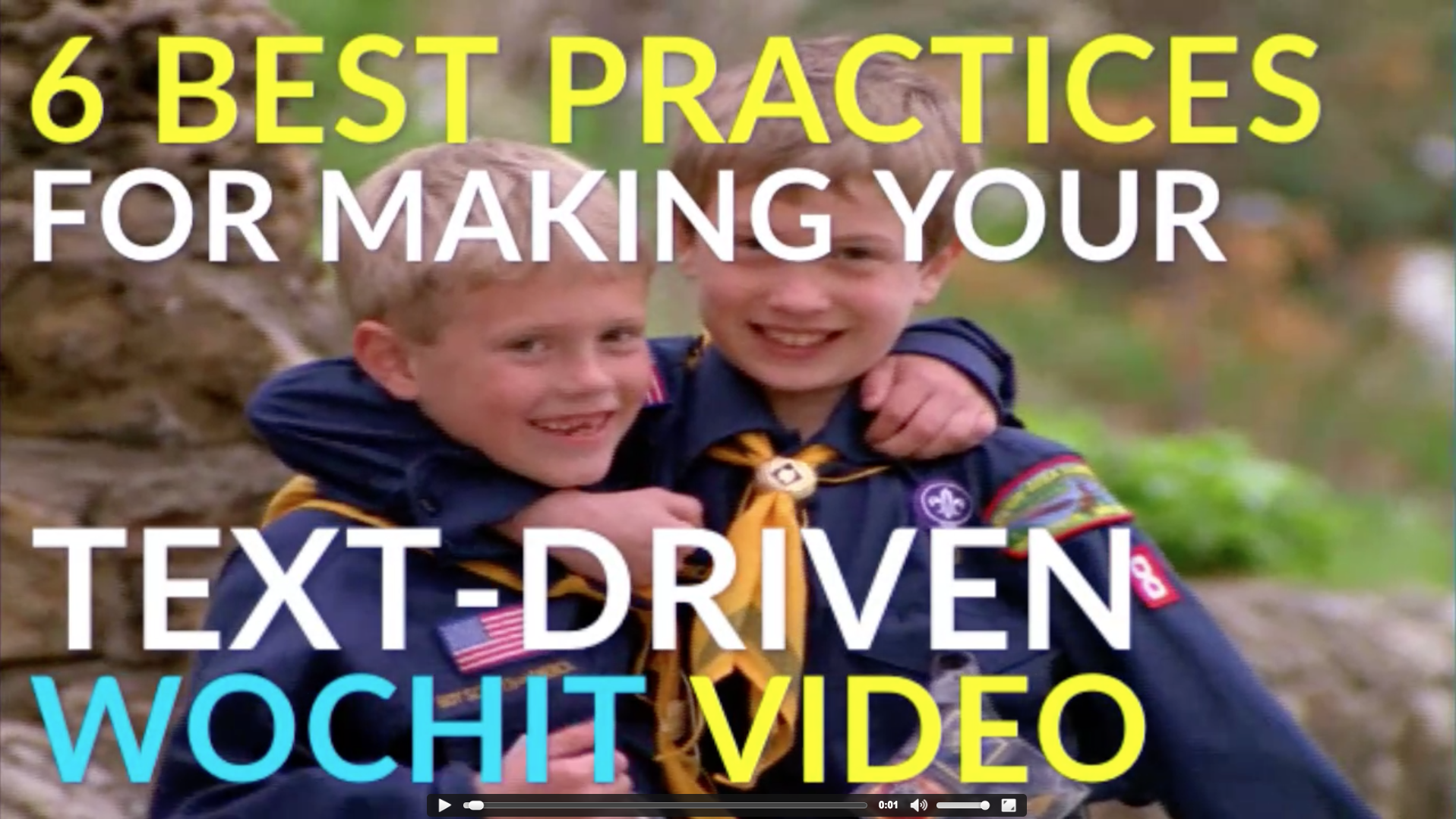
Text has become a major component of many social videos, and using text well is only becoming more relevant on that biggest of social networks. Why? New data from a variety of publishers, including the international ad agency MEC, suggests that as much as 85% of all Facebook video is watched without sound.
We’ve looked at how to tailor your social clips to work on mute before. But as viewing without sound becomes the norm on Facebook, knowing how to effectively utilize text in your social videos is of paramount importance if you are to successfully tell your story. Let’s take a look at what to keep in mind:
Make it readable
First and foremost, you want the text of your video to be easy to read, no matter how or where your audience is watching. Social and mobile have become parts of the same whole, so make sure your text is large enough to be read clearly on mobile devices with small screens.
You can also use simple tricks like alternating the text color of each line, to make reading easier, or emphasize key phrases by giving them a different color than the surrounding text. Just be sure that any colors you’re using stand out in front of the visual assets at play behind. And while you may be tempted to shrink your text in order to cram more information in, that will only make it more difficult to read, and is likely to violate our next tip…
Keep it tight
Cap the amount of any single block of text in your video to three short lines. Again, that’s a maximum amount of text onscreen at once. More than three lines of text is going to start taking up a valuable visual real estate. Big blocks of text can also feel overwhelming to your viewers.
If you have a lot to say, you don’t have to put it all on-screen at once (and you can always utilize voiceover to provide greater insight). You can break up your sentences over two or three splashes. Always try to edit your copy down to a fine point, though, because there’s no need to make your viewers read more than is necessary.
Pick the right position
Even when your video relies on text to tell its story, you still want to keep it to the sidelines. Remember, this is a video we’re talking about, and visual content still drives it.
House your text at the top, bottom, or sides of the frame, and don’t be afraid to move the position around as your visuals change. You always want to keep your text out of the way of the most important and compelling element of whatever visual asset it sits on top of.
Keep these tips in mind for your next Facebook video!

